Numbers

by Linus Edwards


Let's do a thought experiment - imagine if Twitter changed its service so that the number of followers one had was completely hidden from public view. So when you encountered a person on Twitter and looked at their profile, you'd have no idea if they had 5 or 50,000 followers. Would that change how you used Twitter? Would that change how you decided to follow people or what weight you gave to their tweets?

What if we went further and simply got rid of all numbers on Twitter, public or private. No one would know how many followers they themselves had, no one would know if their tweets got favorited or retweeted. People would simply talk to each other and see what they had to say, without having to worry about all the metrics that have become so commonplace on social networks. You'd still have indications of whether you were popular or if people liked things you tweeted, but they'd be more natural and less robotic.

In real life we don't go around with the number of our friends plastered on our forehead. We don't have metrics to figure out how many times the joke we told at a party was then retold to others. We interact more naturally than that, and it has worked for thousands of years. We actually are forced to observe others to determine if we like them, instead of distilling their entire self down to a number. We don't know everything about everyone all the time, and that can be a good thing. The unknown can spur us on to find out more and seek out people we might not have interacted with if we saw they only had eleven followers.

However, I see the counter-argument that these numbers are simply a short-cut, a way to quickly determine social dynamics without having to really understand social dynamics. You can tell immediately if a joke is funny by the number of favs and retweets the joke gets. You don't have to pick up on any social cues anymore, it's simply mathematics. I'm sure this appeals greatly to people that are bad at socializing in real life and like the more simplified set-up that boils things down to clear and obvious data points. It's probably not a coincidence that computer geeks are the ones that created these systems.

But, ultimately I don't think this distillation of socializing down to numbers is a good thing. I do realize I might just be living in the past and have some idealized view of social interactions before the internet. However, I think these numbers are stripping a layer away from our humanity that is important. When we focus more on the numbers and less on the actual people behind the numbers, we lose something. Our interactions become skewed towards getting those numbers, and socializing becomes more a video game with a set goal, rather than simply enjoying people's company.

What's the solution though, can this trend be reversed?

I think if someone did create a new social network similar to my thought experiment, without any stats or metrics, that might help eliminate this phenomena. People would sign up and start interacting with others, not knowing how many followers they had on the service or whether their posts got shared or liked. They’d start to care more about the actual interactions, because that’s all there would be. I'm not sure this network would be successful, but at least it would be something different and pull us ever so slightly back into reality.

The Podcasters: James Smith

by Linus Edwards


This is a continuing series in which I interview great podcasters to learn about their podcasting setups. While the content is always the most important aspect of a podcast, the technical craft in bringing that content to the listeners also deserves attention. I hope this series will illuminate that critical piece of the puzzle.

James Smith is podcast producer and sometimes host, who has a deep knowledge of the technical aspects behind making a quality podcast.

What podcasts do you host?

Currently producing The Verse podcast which is hosted by Justin Gibson with regular crew members James Griffiths and Alec Fraser. I also occasionally appear on the show. We also just recently joined Fiat Lux, the podcasting syndicate headed up by Ben Alexander

The Verse is a weekly podcast where we discuss an episode from the Whedonverse. It pretty much means anything attached to Joss Whedon is fair game. Right now we're working our way chronologically through everything which means were just passing through season 2 of Buffy the Vampire Slayer. We've actually mapped it out and if we keep putting out one episode a week, we'll be going for about 8 years.

Though we haven't put out an episode in like a year, I'd like to ressurect my first podcast, hosted with Griff, called Twobiquity. It was just a show where we could catch up and chat about what we'd done in the last week including TV, movies, music, you name it, we'd cover it.

The final podcast is Unbiquity, which is outtakes from both of those shows. Sometimes the outtakes are better than the actual show.

What's your physical rig? (Computer, Mic, headphones, other accessories.)

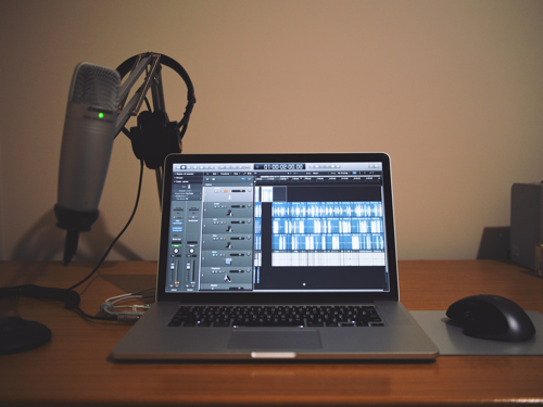
So I use my MacBook Pro with retina display for all aspects of the show. It's a beast maxed out with 16GB of RAM and a 768GB SSD. Once a show has been edited, I usually transfer it off to a Drobo FS that's sitting on my network at home.

In terms of recording equipment, I'm using a Samson C01U which was given to me as a gift a couple of years ago. It's a decent mic and does the job. It used to be on a static arm, but I managed to rig it up to an Ikea TERTIAL Work Lamp and use it as a boom. It's noisy if you move it during recording but I generally set it and I'm golden for the episode

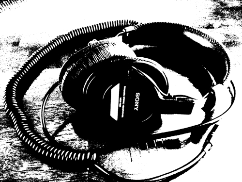
I've had my Sony MDR-V6 Headphones for about 6 years now and they're still as good as when I bought them. They're a great set of headphones and are only about $100.

What type of room do you record in?

I just record in the third bedroom in the house which we're using as a study. It's nothing special but there is carpet on the floor which helps to mitigate some of the echo.

What software do you use for recording and editing?

I'm using Logic Pro X to record and edit the show. We use the double-ender technique where each person records their audio locally and then we sync it via Dropbox. If I'm on the show too, I'll record a local sync track using Audio Hijack Pro so that I can match up all the audio files a bit easier when it comes to editing. I know a lot of people like to use Skype Call Recorder but there have been way too many times when people have lost entire podcasts because it was being used as the only recording method.

Shush is also a great little Mac app which lets you assign push-to-talk or push-to-silence to a function key. iZotope RX 3 plugin works amazingly well in Logic and the Dialogue Denoiser is a lifesaver. I'll also use iTunes to convert to Bounced AIFF from Logic to a HE-AAC (tiny file size and no discernible reduction in quality) file for the final upload.

What do you use to host your podcasts online?

Squarespace - who doesn't. Feedpress handles the feed - need to do this if you want to move hosts, etc.

What's your basic workflow for recording a podcast and taking it to the published stage?

It's slightly different depending on whether or not I'm on the call. As said above we use the double-ender recording technique. It's longer to edit because of syncing the files initially, making sure that they don't drift, and uploading, etc. But better quality and doesn't rely upon the Skype Gods as much.

If I'm recording with the gang, I'll also use this nifty Logic workflow to add markers to the episode for easier editing.

Each co-host has a Dropbox folder that's synced with me where they drop their uncompressed AIFFs of the recording. If I'm not on, someone else will also record a sync track.

In order to keep in touch, we've switched from private messaging in App.net and over to Slack for internal comms. Let me just say this, it works brilliantly and if you're not using it, you should be.

Would you like to change anything about your current podcasting setup?

I'm pretty happy with everything at the moment. The only thing that I'd probably upgrade would be my mic. I hear good things about the Rode Podcaster.


The Simplicity of Apple's Advertising : 1997-Present

by Linus Edwards


The first part of this series can be found here.


The second coming of Steve Jobs to Apple in 1997 has been discussed many times, yet most don’t realize how complete a turn around of Apple he was able to accomplish. In addition to the big picture things he was able to do, such as saving Apple from bankruptcy and completely reinvigorating their product line, he also completely changed their advertising, bringing it back in line with Apple’s previous focus on simplicity.


When Jobs returned, his first order of business in advertising wasn’t to advertise the actual products. He realized the products at that point were not very good, although they had many new ones in the pipeline. Instead, he wanted to make a “mission statement” and show how Apple saw itself as more than just an average computer company. This was a similar idea to Jobs original “Simplicity is the Ultimate Sophistication” ad from the 70s, in which the product was not even shown.

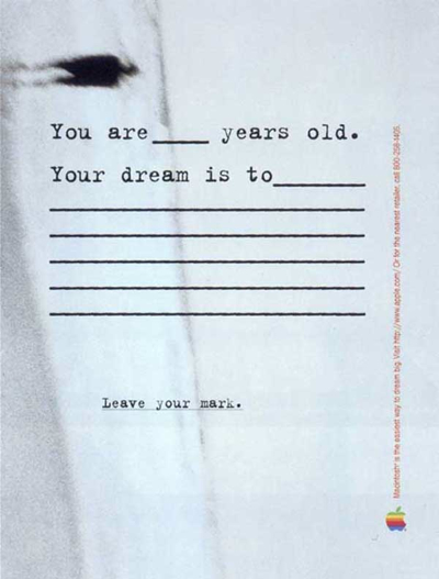
This “Leave your mark.” ad has no reference to any specific computer or part of Apple’s OS, but simply is aspirational. It’s meant to evoke a feeling of endless possibility one has as a child. Apple was playing on your emotions, not trying to convince you logically to buy a computer.

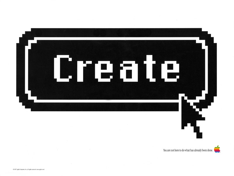
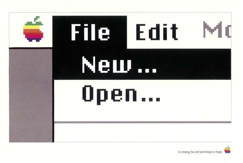
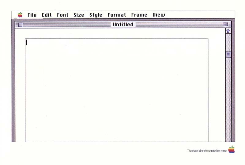
These are a series of three ads that show sections of the Mac OS (some zoomed in) that are starting points. A create button, a new button, and a blank text file. The ads contained nothing but these pictures of the OS, a small inspirational sentence at the bottom, and the Apple logo. Again, while they showed the OS, they really weren’t about the OS itself, but more about invoking a feeling of passion and creativity.


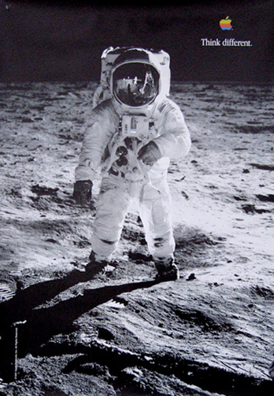
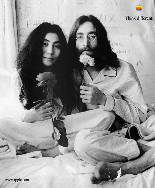
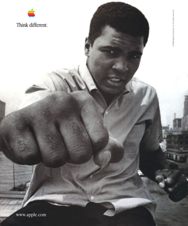
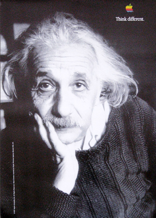
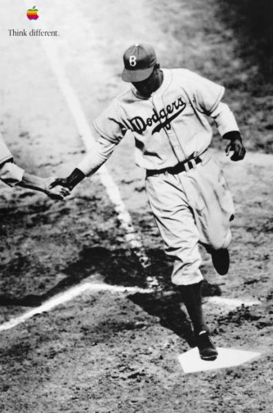
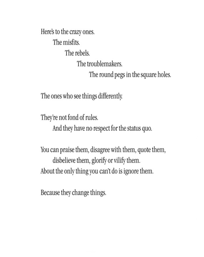
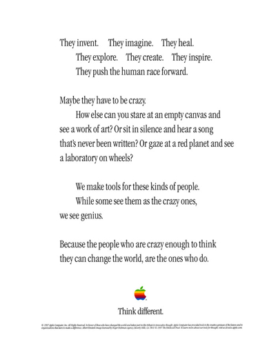
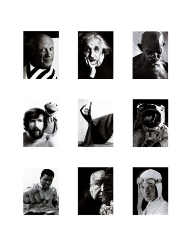
Apple went full force into the “mission statement” type ads with the Think Different campaign. This was probably the highlight of Apple’s advertising throughout its history and is significant even in the history of advertising as a whole. The brilliance of the Think Different ads was again the unwavering simplicity. They consisted of simple black and white photographs of famous visionaries, overlaid with small text that said “Think Different,” and a small Apple logo.

If you didn’t know any better you wouldn’t even realize that Apple was a computer company, as there was no indication in the ads. Apple wasn’t selling products with the Think Different campaign, they were trying to establish a narrative in the public’s minds, that Apple was a revolutionary company that was going to “change the world.”


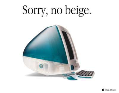
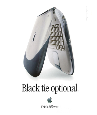
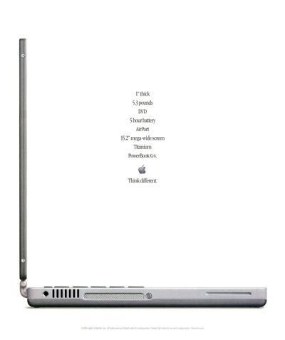
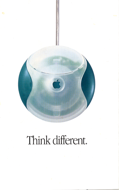
Once Jobs was able to refresh Apple’s product line into his own vision, he began to extend out beyond these initial ‘mission statement’ ads to show the actual products. However, he continued the minimalist aesthetic by copying the earlier advertising templates of the Lisa and original Mac. The ads all were a single beautiful photo of the computer, coupled with a short phrase, and a small Apple logo. Some continued the “Think Different” phrase, although soon that was replaced with more specific and playful lines.

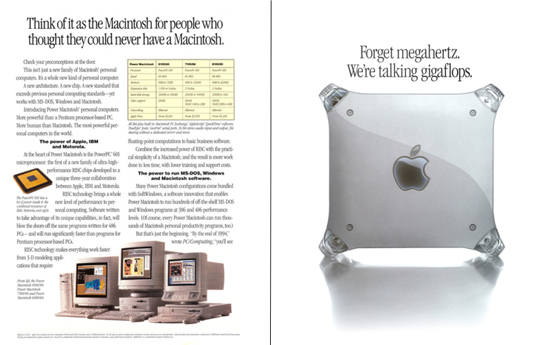
These ads are a starkly different from what Apple had been producing for most of the 90s. Here you can see a comparison of Power Mac ads before and after Jobs return:

1994 Power Mac ad v. a 1999 Power Mac ad


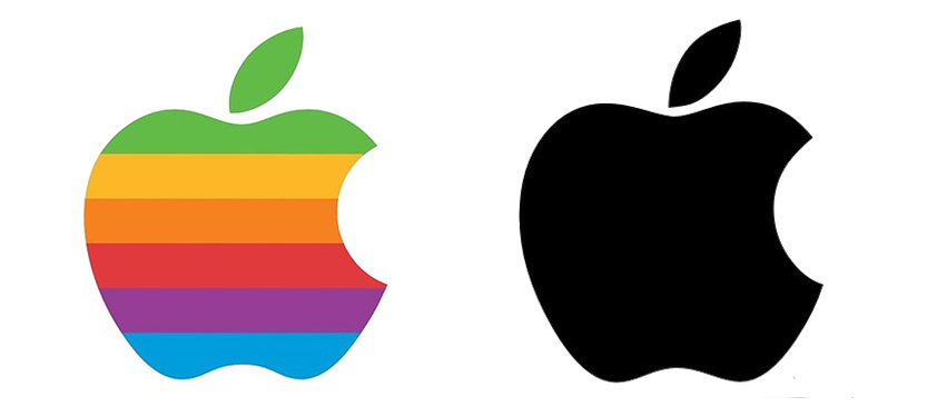
Another big change Jobs instituted after returning to Apple was ditching the classic “rainbow” logo (which Jobs had originally instituted) in favor of a monochromatic version.

"Rainbow" Apple Logo (1976-1998) v. monochromatic version (1998-present)

While not specifically related to advertising, this change shows the move of Apple back to minimalism and simplicity. The logo was stripped of its extraneous colors and reduced to its essential form. Apple could then merely add any color they wanted to the logo in any given situation, including in their ads.


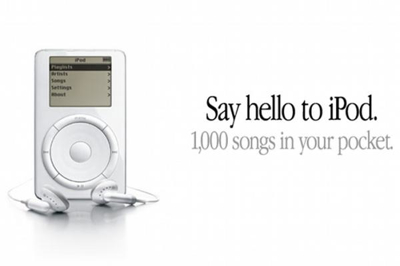
By 2001, Apple started to expand the company beyond simply computers by introducing the iPod. With this new product category, they were faced with how express their vision to the public. While other companies might have went with the bang you over the head approach in trying to get you to understand why you needed an mp3 player, Apple continued to play it simple.

The phrase “1,000 songs in your pocket,” was so basic, yet sold the absolute key feature of the iPod – the fact you could store a tremendous amount of music in a tiny digital device. That’s all the consumer needed to know to get their attention. A beautiful device that stores lots of music.

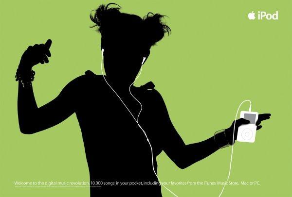
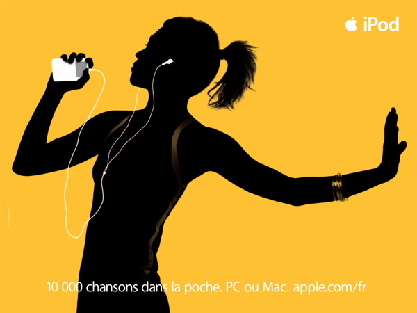
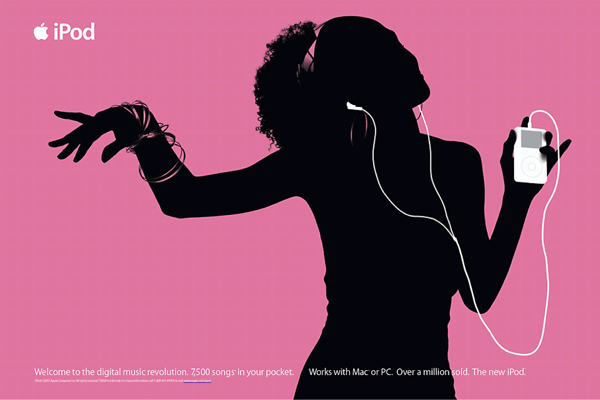
A few years later Apple began a long running ad campaign for the iPod in which they would simply show silhouettes of people listening to their iPods with bright colors in the background. This was a different take on the minimalist philosophy of Apple's ads, adding vibrant colors, but they became iconic. You could glance one of these ads on a billboard and even without the text saying iPod, know exactly what the ad was for.


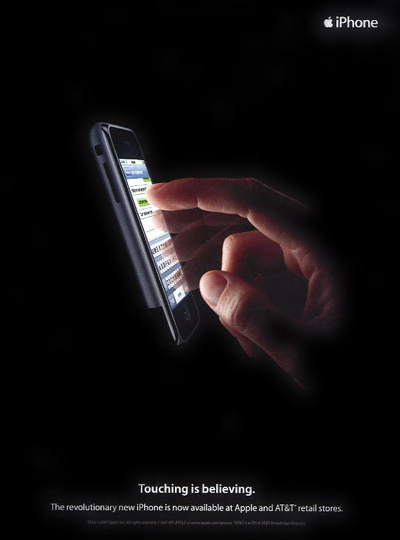
With the introduction of the iPhone in 2007, Apple again was faced with how to express why this product was revolutionary in very stark and simple terms. This original iPhone ad does that in such a simple way that it seems obvious in hindsight. A finger reaching out and touching a glowing iPhone screen with the words “Touching is believing.” This harkens back to the original Mac ad showing a finger touching a mouse button. In both cases the ads cut to the core of why the products were revolutionary, the way you interacted with them. You touched the iPhone directly, and what better way to make a consumer realize that than literally showing a finger touching the device.


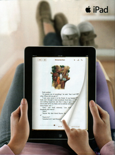
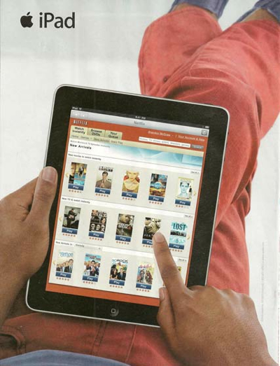
Apple stuck with minimalism with the introduction of the iPad, emphasizing the obvious feature they felt was important - the close, personal connection one has with an iPad. These ads all show people relaxing while using their iPads, using them to read books or watch movies. They wanted to show this was something different than what people usually associated with computers.


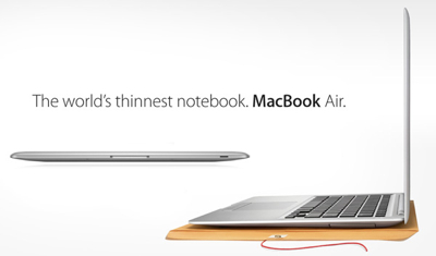
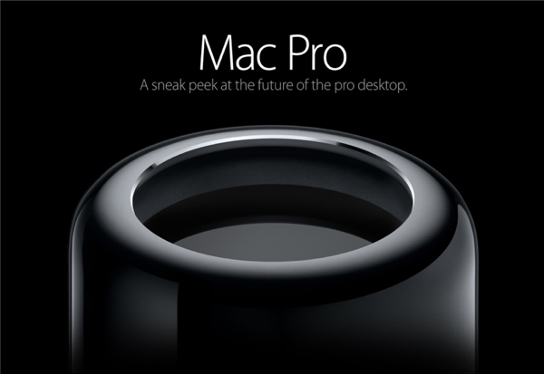
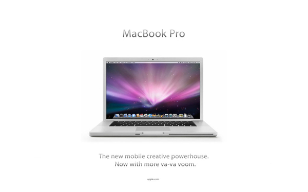
Apple has continued to stick with the simple advertising that Jobs brought back in 1997 up until the present day. This can be seen throughout their product line from new iPhones to iPads to Macs.


I think this retorspective of Apple's advertising can be a lesson for other companies looking to make an impact with their own advertising. Figure out what forms the core of your product and emphasize that. You don't have to throw as much information as possible at a potential customer, but instead cull down things to focus the core idea straight at them. Apple learned that this can be done with utter simplicity.